- Home
- Techniques
- Colored Pencil Strokes
Colored Pencil Strokes: Try These Mark Making Techniques
Colored pencils aren’t just for colouring in neatly between the lines — they’re a beautifully versatile medium for fine art, texture, and expression. The secret lies in the marks you make.
Artists call these coloured pencil strokes mark making, and there as personal as a signature. From tiny dots to swooping scribbles, every stroke leaves a trail of your hand and intention.
Whether you're after the scratchy feel of straw, the softness of fur, or the crisp edge of a cast shadow — it all comes down to how you wield that pencil.
In this guide, we’ll explore five essential mark making techniques:
Jump to a Technique:
You’ll also find tips on layering, colour mixing, and when to grab a sharper point or a gentler touch. So sharpen those pencils (literally), and let’s begin.
Hatching and Cross Hatching
 Basic hatching strokes in one direction to create texture and tone.
Let’s start with a classic. Hatching and cross-hatching are two of the oldest drawing techniques
In hatching, you build texture using parallel strokes — all heading in one direction. Cross-hatching adds a second layer of strokes in the opposite or diagonal direction, creating depth and shadow where the lines overlap.
This method works beautifully with coloured pencils and gives your drawings a lively, woven feel — almost like threads of colour stitched across the page.
Direction Matters
You’re not limited to straight lines. Try horizontal, vertical, diagonal, or even gently curved strokes. See how each one brings a different feeling to the drawing.
Ann Kullberg, in her book Texture in Colored Pencil, often used vertical hatching for delicate texture — a technique she leaned on in her early work.
When cross-hatching, your second set of strokes can criss-cross at right angles or slant in at a gentler angle. Both are useful — it just depends on the effect you’re after.
Stroke Density
Packing your strokes closely together darkens the area wheras wider gaps let more of the paper show through, creating a lighter, airier feel.
 Cross-hatching adds a second layer of lines to deepen shadows and create more complexity.
Pressure & Precision
Soft strokes = subtle shades. Heavy pressure = bolder impact.
You can build up your drawing — layer by layer — with light pressure first, deepening as needed.
Keep your pencil tip sharp for crisp, defined lines. It’s especially helpful when layering multiple directions.
Color Mixing
Here’s where it gets fun. Try layering different coloured strokes in each direction.
In the example below, I started with Lyra Olive Green, added True Blue over it, then softened the centre with a final layer of Light Grey. The colours worked together without turning to mud.
 Layered cross-hatching using Olive Green, True Blue, and Light Grey for blended colour depth.
Practice Makes Progress
Cross-hatching is one of those deceptively simple techniques that improves the more you do it. At first, your lines might look a bit like a startled spider scurried across the page — that’s perfectly normal.
Start small: draw a cube or a simple sphere, and try building up tone with lines in just one direction. Then layer a second direction. Then try adding colour. Little by little, you’ll get a feel for how different angles, spacing, and pressure interact.
Every artist’s cross-hatching has its own rhythm and personality. Yours will too. So give yourself time, and don’t be afraid of a wonky line or two — they’re often more charming than perfect ones.
Colored pencil strokes - stippling
Now for something a little dotty.
Stippling is the art of placing tiny dots — lots of them — to build up tone, texture, and depth. It’s slow, deliberate, and surprisingly soothing (until your wrist starts to mutiny). Think of it like building up a surface with breadcrumbs of colour.
It also shares some DNA with pointillism, a 19th-century painting style where artists used dots of pure colour to create entire scenes.
With coloured pencils, you can get that same beautifully speckled texture — ideal for things like sand, stone, or anything with a fuzzy or grainy surface.
Dot Density
The closer the dots, the darker and more solid the area appears. Space them out, and you’ll get a lighter, airier effect. This is how you shade with stippling — no smudging required.
Want a three-dimensional look? Start with sparse dots in your highlight areas, then gently pack them tighter as you move into shadows.
 Beginning the stippling process — light dot placement with room for layering.
Dot Size
Your dot size naturally changes as your pencil dulls — and that’s actually helpful.
Use a sharp point for delicate details or highlights. As the tip wears down, move into darker areas where slightly larger dots blend together to create depth.
It’s like having two tools in one — no need to sharpen just yet.
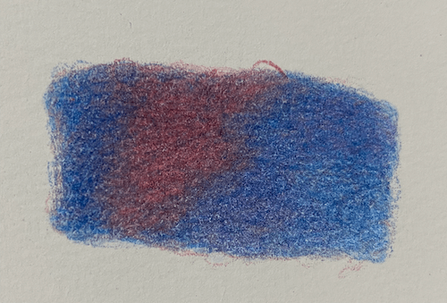
Color Mixing
Layering different colours of dots creates visual blending and richness. You’re not blending them physically — you’re letting the eye do the work.
For example, I used Lyra Night Green and Wine Red on textured watercolour paper for a stippled shadow, then added a final scatter of yellow and purple to enrich the tone without dulling the original colours.
 Layering additional colours — yellow and purple — for depth and warmth.
Patience (and a bit of stretching)
Let’s not sugar-coat it — stippling takes time. Lots of time. But if you enjoy the slow rhythm of small, repeated marks (and have a good playlist or a chatty cat), it can be deeply satisfying.
That said, it’s wrist-taxing. So take breaks, stretch your fingers, and give your hand a breather now and then.
Perfect for Textures
Stippling shines when used for subjects like:
- Pebbles and sand
- Weathered bark
- Distant foliage
- Mossy rocks
It also plays nicely with other techniques — dot in the shadows, hatch the highlights, and you’ve got yourself a mixed-method masterpiece.
Fur & Texture Lines
Now let’s loosen things up a bit.
When it comes to drawing fur, grass, or anything with a wispy, layered texture, tidy dots and lines just won’t cut it.
This is where you trade in your careful hatch marks for something more free-flowing — short, irregular strokes that overlap and meander like tufts in the wind.
It might look like scribbling, but make no mistake: the trick is in being randomly deliberate.
Start with the Scribbles
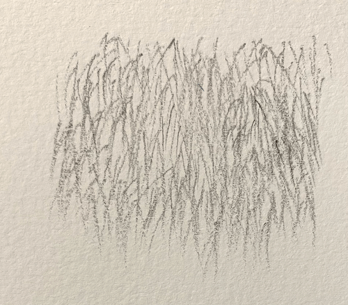
First layer of short, separated strokes — keep them varied and imperfect.
Begin with short strokes in different directions. Avoid making them all the same length or angle — this isn’t a haircut, it’s nature. Let the pencil wander slightly as you go, and leave some paper showing through in this first layer. That patchiness creates a sense of depth straight away.
Use a sharp pencil at first. You’ll get crisp, fine strands. As your tip dulls, the strokes soften — perfect for blending into deeper, shadowed areas.
Embrace the Mess (Strategically)
The key to fur and texture lines is layering. After your first scribbly pass, go back in with new colours. Add longer or shorter lines. Vary your pressure. Build up areas where shadows would fall, and keep highlights more sparse and light-handed.
You’re aiming for:
- Controlled randomness (yes, that’s a thing)
- Variation in length, angle, and colour
- Gradual transitions between light and dark
 Adding darker strokes and extra colors to build texture and shadows.
Shadows & Highlights
To deepen a shadow, use a darker pencil and cluster your strokes more tightly together. For highlights, try a light grey, cream, or even white pencil to soften and lift the area. You’re not covering it — just muting the edges so it blends with its neighbours.
This layering technique doesn’t shout — but it whispers realism. It’s especially lovely for:
- Animal fur
- Grassy patches
- Feathers
- Whiskers (just add with a sharp pencil at the end!)
Imperfections Add Charm
Don’t fuss too much over making each stroke perfect. Real fur isn’t perfect.
A little overlap, a few gaps, even an odd angle here and there — they all help your drawing feel more natural and alive.
Scumbling
If hatching is neat handwriting and stippling is a patient dot-dot-dot, then scumbling is... well, scribbling small, circular, overlapping strokes. It's a bit like doodling while you are sitting on hold during a phone conversation, only this time you are doing it with purpose.
It’s a wonderfully forgiving technique, especially good for soft textures, gentle shading, and layering up colour in a way that feels organic and free.
Little Circles, Big Results
Start by applying light pressure and making small, continuous loops. These don’t need to be perfect circles — think of them more as meandering paths. Let them overlap and fill the space gradually.
Use different sizes and speeds — tight spirals for detail, looser ones for broad areas. Overlap them generously to build a textured, almost velvety surface.
Best Used For...
Scumbling is perfect for natural textures, especially when you don’t want hard lines or obvious patterns. It shines in:
- Distant foliage
- Grass in the background
- Pottery
- Soft shadows
- Out of focus areas
Build Layers Like a Cake (But Don't Eat It)
 Building intensity with added colours and slightly more pressure.
Once you’ve got a base of light scumbling down, you can add more colours on top.
Try adding a deeper tone in shadowed areas, or a complementary colour to create visual richness. Keep the motion loose and the pressure gentle to start — you can always go back and darken later.
The result is a rich, blended area of colour that still shows movement and texture.
Mix It Up
Don’t be afraid to mix colours as you scumble.
Layering different hues can produce subtle, luminous effects that are hard to achieve any other way. Think of it like seasoning a dish — a little unexpected colour can bring everything to life.

Initial scumbling layer using small, overlapping circular strokes.
Scumbled area after burnishing with a white pencil for a smooth, polished effect.
A Labor of (Layered) Love
Like stippling, scumbling takes time. All those tiny circles add up.
But there’s something quite calming about it too — like colouring in a gentle storm cloud. And when it works, it gives your drawing a depth that feels almost touchable.
Pencil Pressure: The Unsung Hero
Sometimes it’s not what you draw, but how hard you press while doing it.
Pencil pressure is the invisible ingredient that can turn a flat sketch into a rich, layered drawing. It affects colour intensity, layering ability, and even the mood of your drawing. And once you learn to control it, you’ll start to feel like you’ve unlocked a secret handshake with your pencils.
Let’s break it down by degrees.
Light Pressure
Gentle, feathery strokes — ideal for:
- First layers of colour
- Sketching outlines you’ll later blend or cover
- Subtle details in light areas (like downy fur or misty skies)
Light pressure keeps the tooth of the paper intact, which means you can layer and build without turning things muddy too soon.
Use the side of the pencil for soft coverage, or a sharp tip for delicate lines.
Medium Pressure
This is your all-purpose, everyday setting — not too soft, not too firm. It’s great for:
- Mid-tones
- General layering
- Blending colours without burnishing them
You’ll feel the pencil start to grip the paper a bit more here. Colours get brighter, but you can still layer on top with ease.
Firm pressure
Now we’re cooking. Firm pressure lays down bold, saturated colour and is perfect for:
- Dark shadows
- Strong edges
- Accents that need to stand out
But! A word of caution — pressing too hard too soon can flatten the texture of your paper (known as the “tooth”), making it hard to add more colour afterward.
Heavy Pressure and Burnishing
Burnishing is when you press really hard to smooth and blend all the layers into a shiny, polished finish. It’s best done with:
- A white pencil
- A light-coloured pencil
- A colourless blender
It can look stunning, especially on glossy highlights or smooth surfaces — but once you’ve burnished, that area is more or less done. The paper won’t take much more.
And yes, you can go overboard. If your pencil starts to gouge the surface or you hear a squeak... maybe back off a little. (Ask me how I know.)
Relax Your Grip
If your fingers feel like they’ve been wrestling a badger, you’re holding on too tight. A relaxed grip gives you more control and reduces fatigue — especially helpful when you’re working on longer pieces or fiddly details.
Try This
 Varying pencil pressure from light to heavy with a single colour — note the shift in vibrancy and coverage.
Grab a scrap of paper and pick one coloured pencil.
Start with the faintest pressure you can manage, then slowly increase until you’re pressing as hard as you dare. You’ll end up with a gradient that shows just how much one pencil can do — all without switching tools.
Once you get comfortable adjusting pressure mid-stroke, you’ll be adding depth and dimension almost instinctively.
And that’s the magic of pressure: quiet, subtle, and deeply powerful.
Like the difference between a whisper and a shout — both have their place. It’s knowing when to use which that makes your drawing sing.
Final Thoughts: Your Pencil, Your Voice
Using colored pencil strokes, also known as mark making, isn’t just a technique — it’s a conversation between your hand and the paper. Whether you’re hatching, dotting or scribbling with wild delight, each stroke adds your voice to the page.
Here’s what we’ve explored:
- Hatching & Cross-Hatching – for building structure, depth, and shadow with layered lines.
- Stippling – for soft texture and subtle colour mixing, one patient dot at a time.
- Fur & Texture Lines – for natural, organic movement in grass, fur, and anything fluffy or wispy.
- Scumbling – for rich, layered colour built from gentle, swirling strokes.
- Pencil Pressure – the secret sauce that controls vibrancy, softness, and the very mood of your drawing.
There’s no one “right” way to use these techniques. Try them. Mix them. Break the rules a little. Over time, you’ll develop your own shorthand — your own collection of textures and strokes that feel like home.
So go on. Pick up that pencil. Make a mark. And see where it takes you.
Would you like our occasional newsletter?
You might like these
Underpainting coloured pencil
How to use underpainting to achieve colour density in a coloured pencil painting. We cover various methods of creating an underpainting.
How to Burnish Colored Pencil: Tools, Techniques & Advanced Tips
Achieve a professional, polished finish by burnishing colored pencil! Explore our guide for essential tools, techniques, and advanced tips.
Coloured Pencil Techniques to Enhance the Quality of Your Art
Learn colored pencil techniques with our easy guide! Unlock essential skills to improve your art. Perfect for beginners and pros alike. Get started now!


Copyright © 2009- pencil-topics.co.uk All rights reserved
Home | About Us | Contact Us | Privacy Policy